Peek-A-Boo Commercial Signs
When designing your signs it is important to think about the needs you have and the eventual placement of your sign. Are you putting a small sign in front of a residential property or a large sign on a busy highway? The designs of these signs are going to be drastically different in order to insure that your information is effectively conveyed. So with these things in mind, our graphic designers want to share some insider information for you to consider when designing your signs.
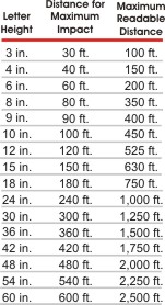
Readability Chart
What is best font for busy highway signs?
Probably the most important thing we can share with anyone designing their own outdoor signs is to be very careful with the text. Fun fonts can be an asset, they are great when they help to convey an overall message, but many of those whimsical or funky fonts are very hard to read. As a heading they can be readable; however probably not to be used for small body copy, your best choice for that is a simple Times New Roman or Arial font.
Avoid all CAPS
Another simple way to promote readability of your sign is to avoid using all CAPS; while this does emphasize some important information it drastically affects the ability to read quickly and accurately. Instead use a bold or italic version of the font or bullet points to help highlight key points and help make the sign clear to potential customers.
How to make body content on sign?
The amount of text you are including should also be considered, signs are meant to grab attention of potential customers and a sign covered in tons of tiny text isn’t going to bring you clients. The amount of body copy should be considered when choosing the size and location of your sign. If you are looking to catch customers flying by your highway-placed sign at 60MPH you are going to want to seriously edit the text to make sure all the information has enough space to remain readable. Consult the “Letter Visibility” chart for the best letter height to viewing distance for your needs.

